News: October 2020
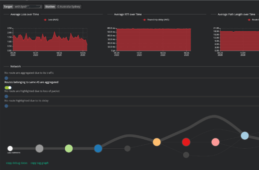
Network Path Visualization
Kadiska now can simplify the visualization of network routes by displaying only the BGP Autonomous Systems (AS) between stations and targets (and not the details of every router on the way).
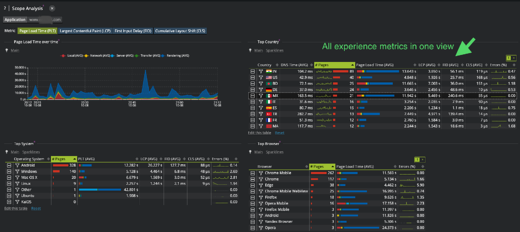
All experience metrics in a single view
To allow to pinpoint faster where your app can be improved, content loading, interactivity, visual stability and errors are accessible on a single page.

Top pages: identify instantly the origin of slowdowns
You can now visualize more metrics to understand immediately the changes that impact the most important pages of your app, thanks to an enhanced metric set.
Resource compression and caching
To track the impact of the different resources used on your app performance, we have added new metrics on compression and caching.
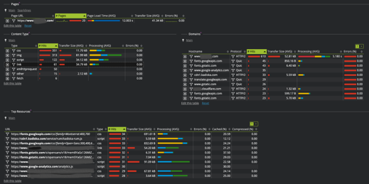
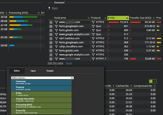
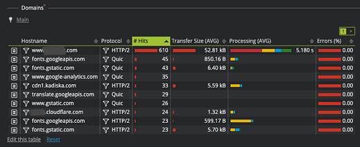
Protocols used to reach your hosts
You can now relate the protocol used (HTTP1.1, HTTP2, Quic) to the performance of your hosts (application, CDN, 3rd parties).
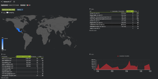
Network connectivity between your users and your resources
This screen has been improved to understand the geo localization of your users, the operators they use and the impact on the network performance to your resources.
UX improvements
As in every iteration, we improved our UI based on your feedbacks. Drill down buttons are made more explicit; click zones have been improved.
Testing new visualizations faster
To implement and visualize your requests faster, we have set up the possibility to customize in real time the tables, filters, widgets (bars, sparklines, etc.). This way, we can show you new views "live". This capability is only internal to Kadiska for now.