News: October 2020
Network Path Visualization
New cleaner look and feel for the path visualization.
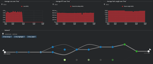
Highlight performance hogs
A simplified box to highlight the links that suffer from packet loss and high delay.
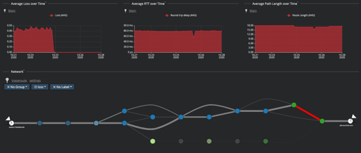
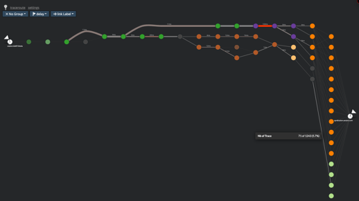
Track the latest path used
This has been frequently asked by our fellow DevOps partners: we can now highlight the latest path used vs the others.
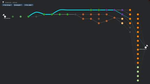
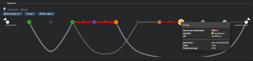
AS Path visualization
View the AS path (sequence of operator networks) between stations and targets! This has been finalized and is now fully operational. Looking forward to your feedback.
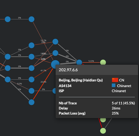
New packet loss heuristic in place
After testing and receiving feedback over the last two weeks, we have validated the move to a new heuristic for packet loss computation.
Many other Tracer UI improvements
You can now add custom labels on the links and choose the label on each node to indicate the information that is the most meaningful for you.
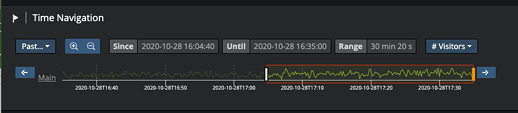
New time navigation
This one responds to one of your top requests: be able to change the time interval on which you see data and apply it on whole the data set you were viewing (and not have to navigate through the data again and again). Well this is now done!