Alerts management
Alerts overview
As explained in the Main concepts section, Kadiska supports Webhooks to notify external platforms about alerts.
But you can also use the Kadiska interface to visualize and diagnose alerts. Kadiska delivers three levels of alerts details, starting with a main alerting dashboard. This dashboard is available from the main menu (1):
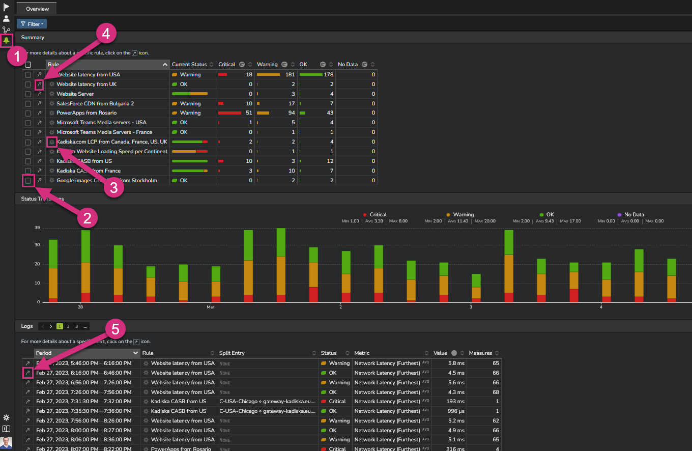
This view provides a table with the status of the alerts triggered during the chosen time frame, the evolution over time of all alerts occurrences, as well as the list of all individual alerts.
From this view, you will typically:
- Filter on a rule your are interested in (2)
- Access any rule definition (3)
- Access any specific rule dashboard (4)
- Access the second level of alerting detail by selecting one alert from the list (5)
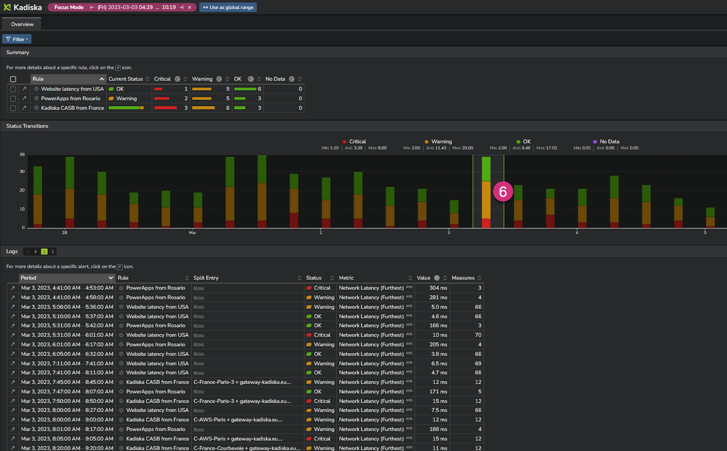
You can also use the "focus mode" by selecting a more precise time frame directly in the timeseries (6).
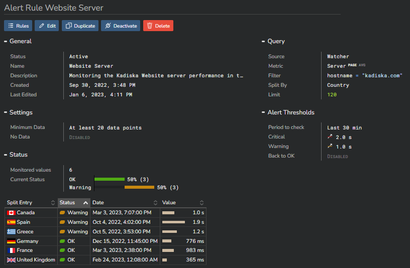
Access to rule definition
The rule definition view shows all parameters the rule has been based upon.
In case of a "split by" configuration, this also provides an overview of the different alerts per monitored group that have been triggered.
From this view, you can edit the configuration, duplicate it, deactivate it or delete it.
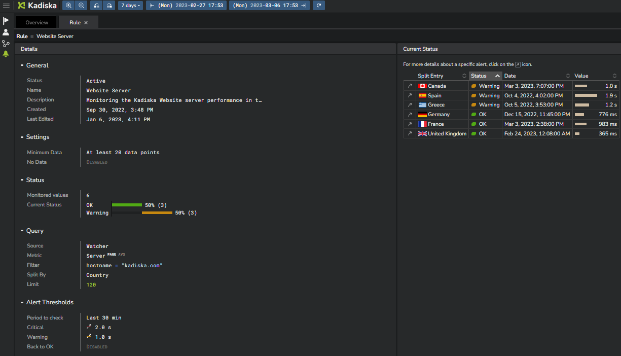
The "Rule" dashboard
This dashboard is another way of seeing how a rule has been defined and related alerts status.
From this view though, you cannot perform any change to the rule configuration.
Getting alerting details
Click on an alert link (4) to get more details.
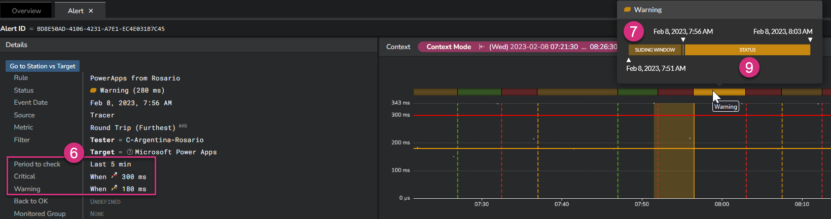
At the left side (6), you can see the alerting calculation interval and corresponding thresholds.
On the screenshot above, you can see that the Kadiska alerting engine calculates the average RTT on a period of 5 minutes. If the average value of all measurements done during this 5 minutes exceeds 180ms, the warning alert is triggered. It will be a critical alert in case this value exceeds 300ms.
At the right side, mouseover any alerting status to see more details.
First, the "sliding window" (7) shows the time frame considered for each individual metric calculation. On the screenshot, you can see that this sliding window is 1 minute.
This means that all collected measurements during this 1 minute time frame will be averaged.
Considering a 5 minutes period (6), this means that up to 5 RTT calculations (1 per minute) will finally be averaged to calculate the baseline that is compared with the configured thresholds.
As the sliding window is 1 minute, this means that this calculation process is executed every minute, taking the 5 last minutes into account for the alerting status computing.
Finally, the Status (9) provides the duration of the alert itself.
In our example above, the alert stayed in the warning status between 7:56AM and 8:03AM before moving to a critical status. This means that during 7 consecutive calculations, the average RTT calculation over the last 5 minutes exceeded the warning threshold, while staying below the critical threshold.
Understanding the alert context
When you click on a specific alert (10), you are automatically routed to the "Alert" view.
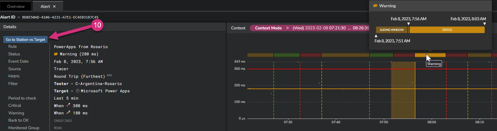
This view provides all details about the circumstances that triggered the alert.
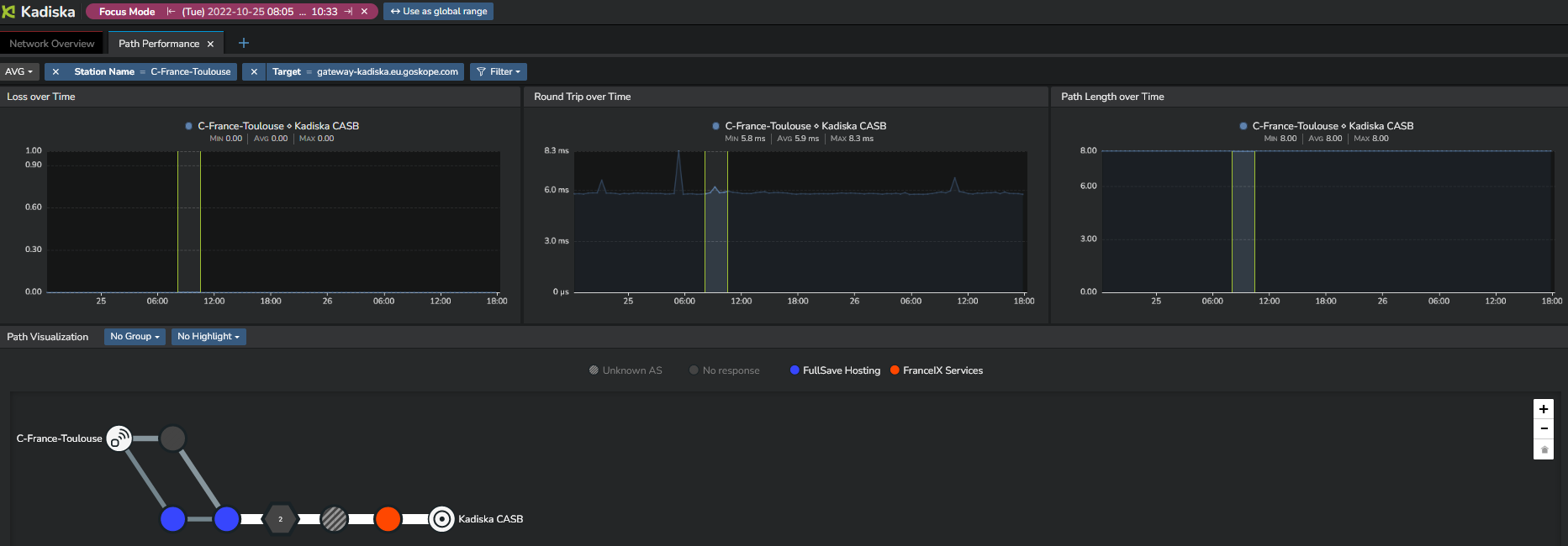
Finally, in case you monitor Tracer metrics and use the "Split by" feature on the combination "Station name" and "Target", this view provides a link to the corresponding Network Path dashboard (6) so that you can quickly troubleshoot the issue and understand whether this degradation came from a redirection, a BGP routing change, or a link/node degradation.
This is what you would get in this example:
Other links to contextual data will be added in the product for other types of metrics and "Split by" combinations.