Network path visualization
Basic concepts
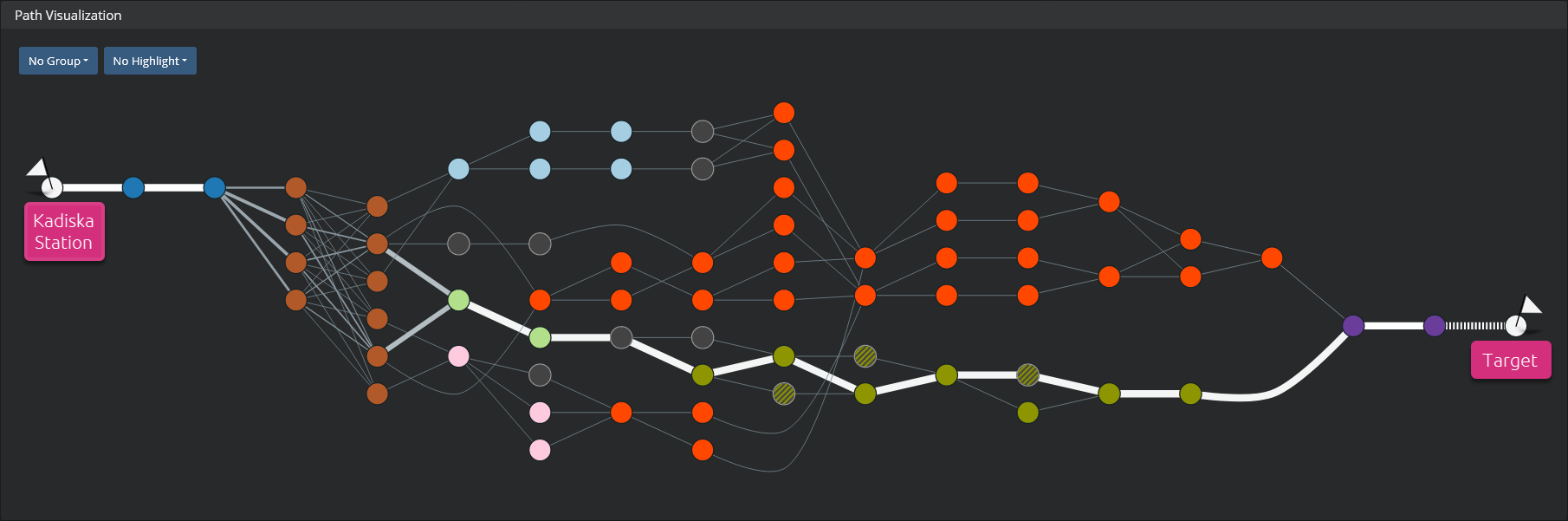
The network path visualization shows the path(s) of network traffic between a Kadiska Station and a target (defined in the Net-Tracer configuration).
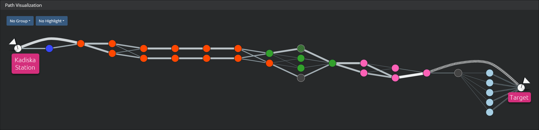
The path discovery process is explained here. The target can be a domain name or an IP address. In the current release, Kadiska supports IPv4 addresses only. Each node in the graph identifies a router. The color corresponds to a specific ISP/AS (Internet Service Provider / Auntonomous System) so that you can easily distinguish the different operators that are traversed.
Mouseover any of the nodes to get more information:
- IP address of the router
- Location of the router, as it is provided by the AS owner in the Regional Registry (AFRINIC, APNIC, ARIN, LACNIC or RIPE NCC)
- AS number and corresponding description
- ISP identification name
In addition to these data about the router itself, Kadiska provides the following metrics:
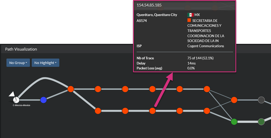
- Traces: for the selected timeframe, this provides the number of times the Net-Tracer test traffic passed through a router. From the picture above, you can see that the traffic passed 75 times through the router, for a total of 144 tests. So this router has been used in 52,1% of the discovered paths. Without having to select a specific router, you can easily identify the most used links by looking at their thickness. The thicker the link, the more it is used.
- Delay: link delay
- Packet Loss (avg): average packet loss value at the node level
As explained here, the routers do not always respond to Net-Tracer test traffic sent by the Kadiska Station. In this case, Kadiska can still identify the router but cannot provide any related data. In the network path visualization, these routers are identified by greyed nodes.
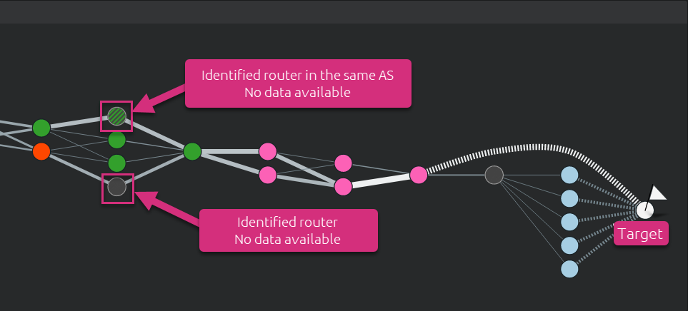
As highlighted in the picture above, any unknown node between two different ASs is simply greyed out. In case the downstream and upstream routers reside in the same AS, the unknown router is greyed but keep the color of the identified ISP (node is colored with stripped lines).
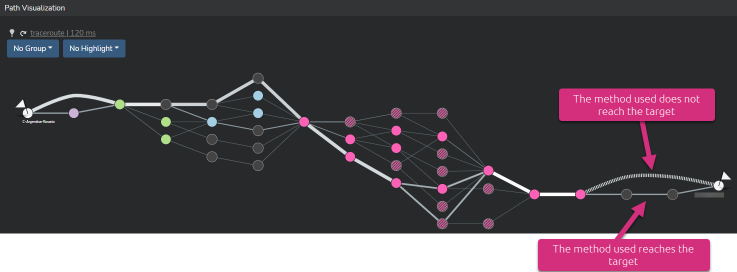
When the target does not respond to any Net-Tracer test traffic (click here for more details), the link between the last identified router(s) and the target are symbolized by stripped lines.
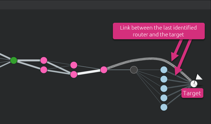
In such a case, the end-to-end RTT value as well as total packet loss can only be measured up to the furthest discovered router. This is where choosing another method or combining different methods can solve this problem. The screenshot hereunder shows a path that combines different methods. One of them reaches the target.
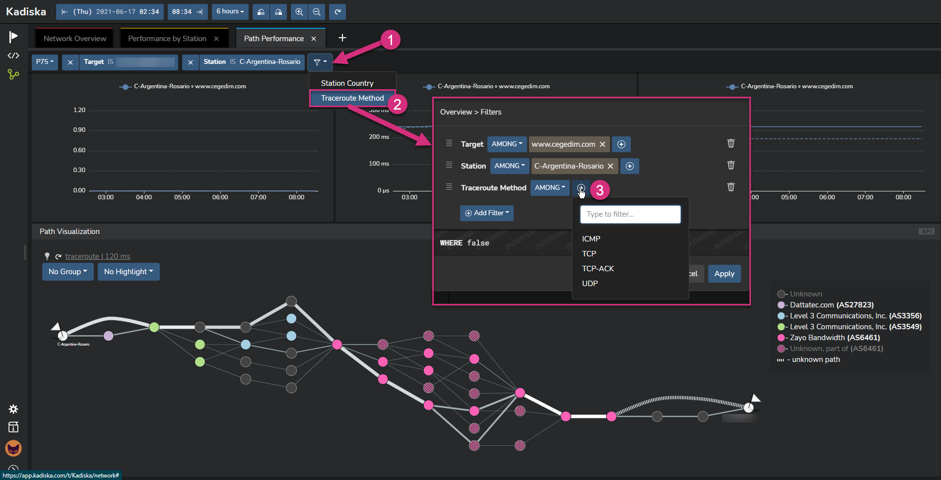
So, as you can see, using different Net-Tracers methods for the same target combine all measurements into one converged network path. If you want to visualize data that correspond to a specific method, you can use the global filter:
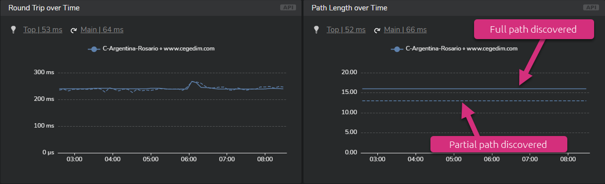
In all timeseries widgets, metrics related to partial path discovery are identified by stripped lines. Plain lines are used when the full path to the Net-Tracer target is successfully identified.
Identify high packet loss values
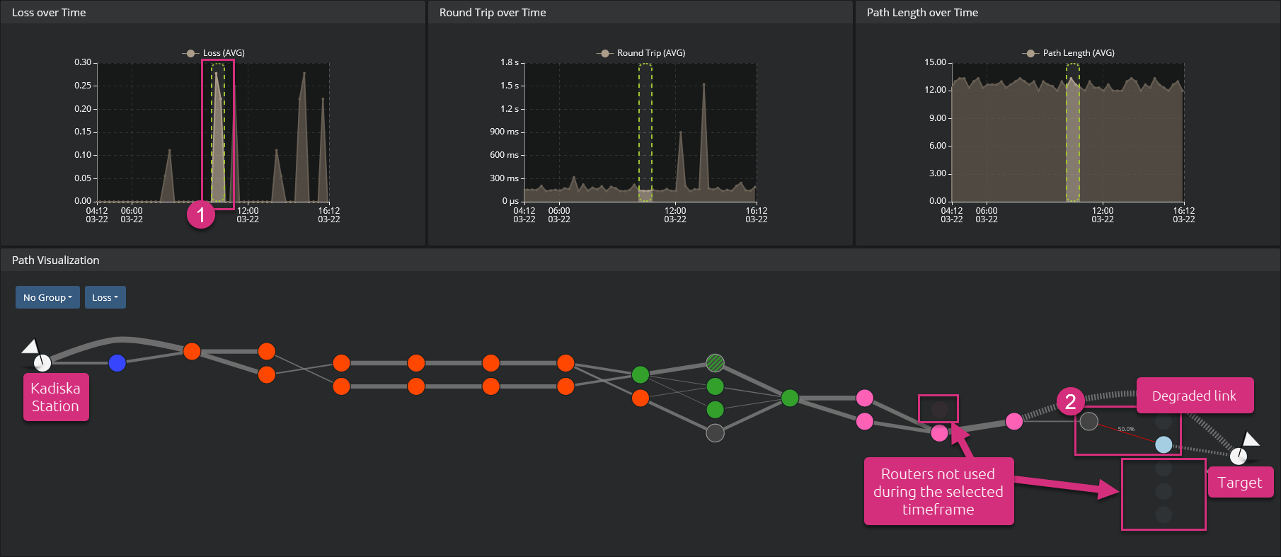
If you want to identify links that experience packet loss, go to the second menu at the top left corner and select the option "Loss". The links with high packet loss value are highlighted in red (the higher the packet loss value, the deeper the red).
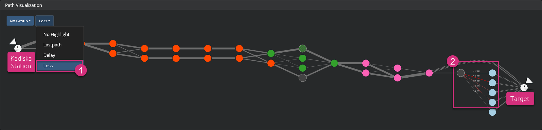
A good way to detect any period of high packet loss and see the link(s) that suffered from this degradation consists of looking for peaks of values in the "Loss over Time" graph. Select the period of degradation by clicking and dragging in the graph itself. The network path visualization automatically:
- only highlights the used path(s) during the selected timeframe
- shows degraded link(s)
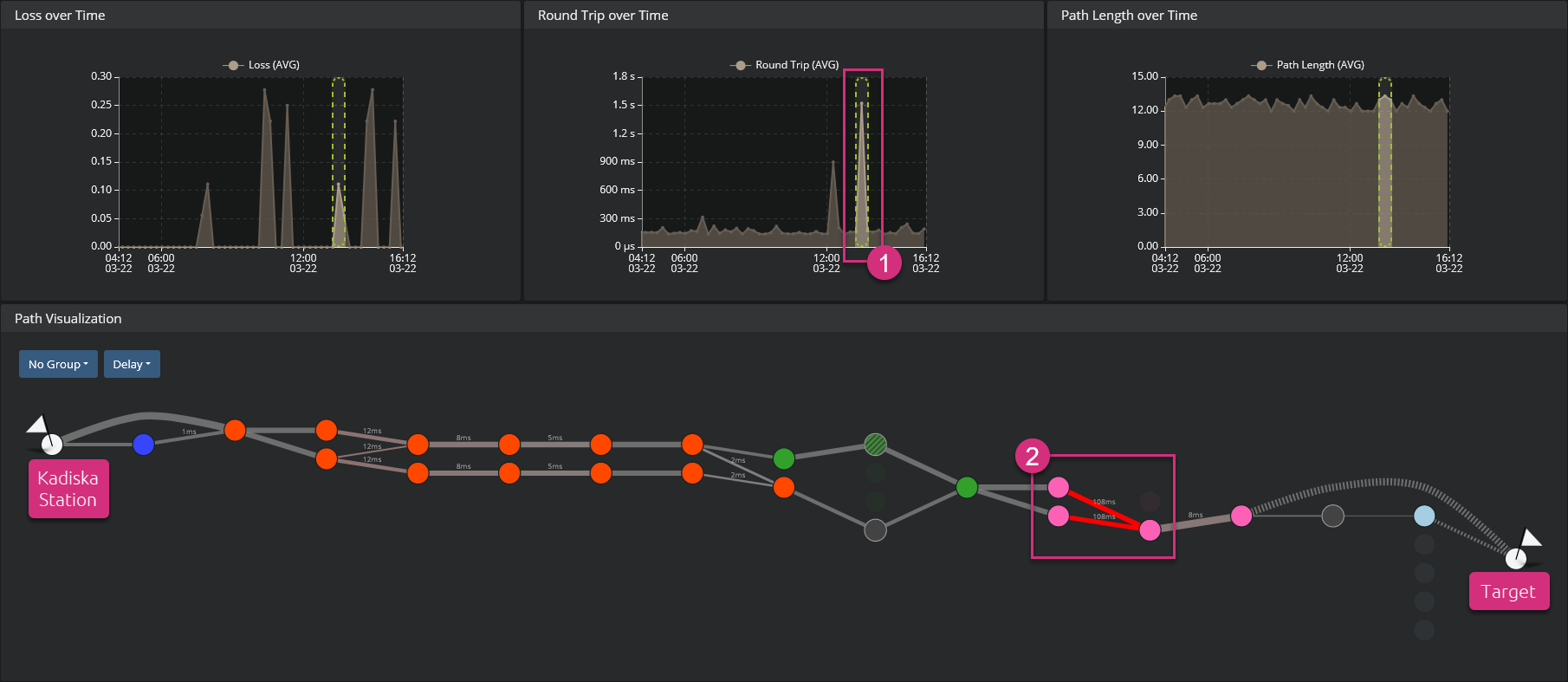
Identify high latency values
The principles are the same as for packet loss. First, go to the second menu at the top left corner and select the option "Delay" to highlight link(s) that suffer(s) from high network latency.
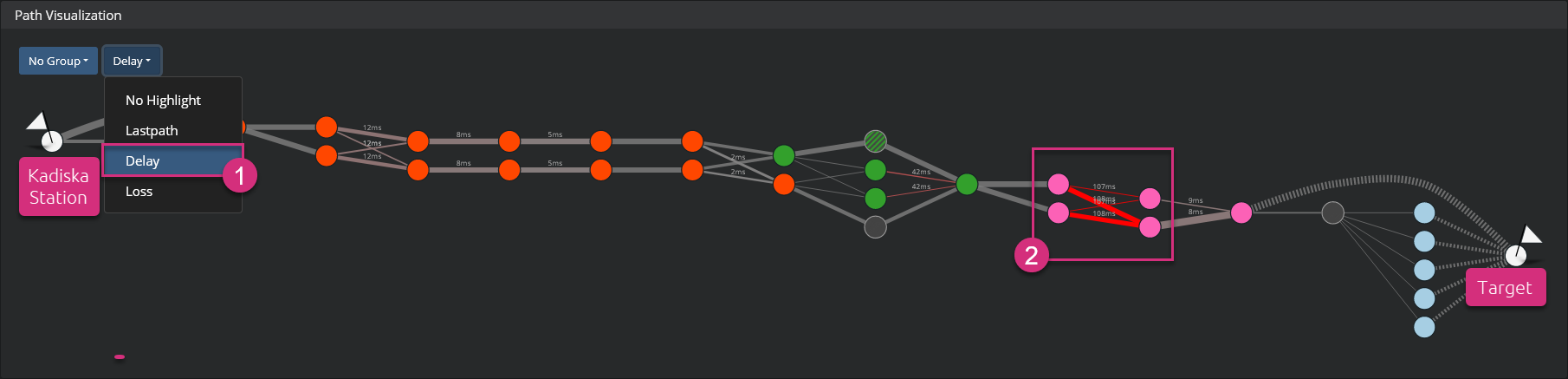
You can also select any peak in the "Round Trip over Time" graph to quickly identify the link(s) that experience(s) high latency.
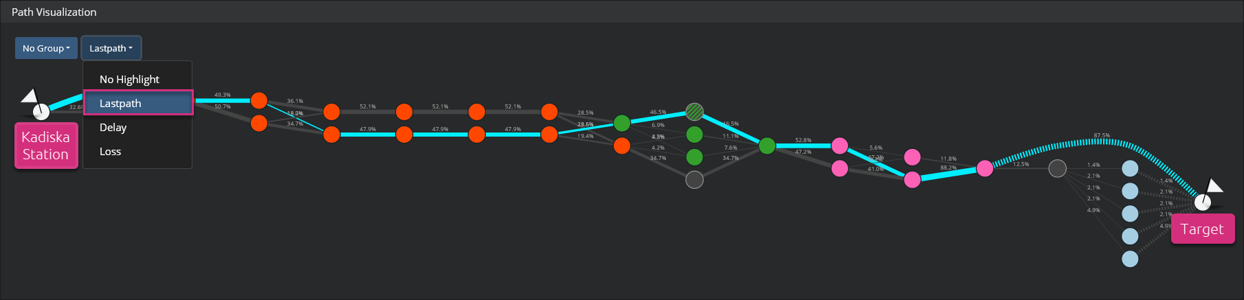
Last path
The last path shows the network path taken during the last Net-Tracer test in the selected timeframe. Go to the second menu at the top left corner and select "Last path". The last path is then automatically highlighted.
Simplify the network path
In some cases, depending on the chosen timeframe as well as network path complexity (multiple paths to distinct ASs, load balancing, routes changes over time, ...), it may be difficult to get a clear view of the different network paths and related performances. As explained previously, focusing on a precise timeframe from the graphs can highlight specific paths. But if you want to keep the whole timeframe, there are two additional ways to simplify the network path visualization. Let's take the following simple example and look how it is possible to focus on some relevant information.
Group by AS
When the network path visualization becomes complex, you may be only interested in knowing which ASs are being traversed. In which proportion and with which level of performance? To answer these questions, you can group the nodes by AS. For this, go to the first menu at the top left corner and select the option "Group By AS".
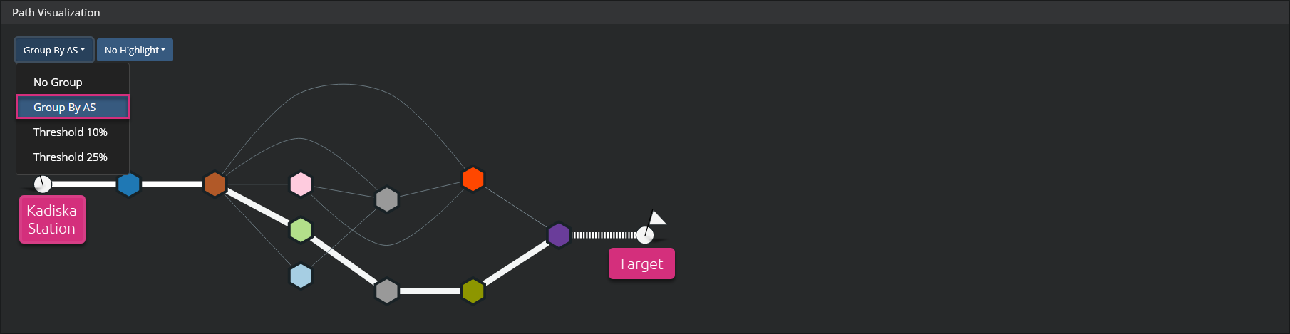
This view can be combined with the options from the second menu (packet loss, latency and last path) to highlight specific points of interest. Mouseover any of the AS nodes to see details about its internal routers.
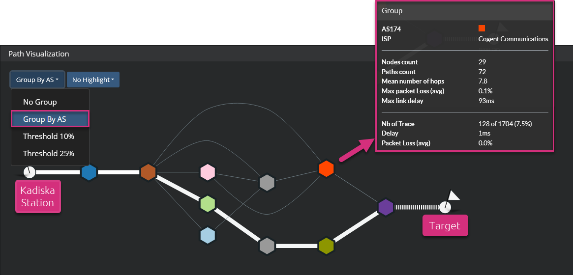
| Information provided | Description |
|---|---|
| Nodes count | Number of routers in the AS |
| Paths count | Number of Net-Tracers tests that used routers in the AS |
| Mean number of hops | Mean number of hops from all paths within the AS |
| Max packet Loss (avg) | Highest packet loss (node level) value amongst all routers in the AS |
| Max link delay | Max link delay value amongst all links between two consecutive routers in the AS |
| Traces | Number of Net-Tracer tests that passed through routers from this AS |
| Delay | Link delay to enter the aggregation of routers in the AS |
| Packet Loss (avg) | Average packet loss at the entry of the aggregation of routers in the AS |
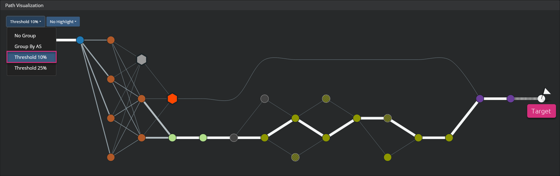
Work with thresholds
If you do not want to group nodes by AS and still want to simplify the path, you can focus on the most used paths. You can do that by removing paths that are used less than either 10% or 25% of the times. Go to the first menu at the top left corner and select the option "Threshold 10%" or "Threshold 25%" depending on your needs.
Network path visualization example with 10% threshold:
Network path visualization example with 25% threshold:
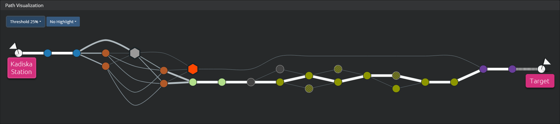
The different nodes that correspond to the least used routes are grouped together. Mouseover any of the groups to see the same information as for the grouping by AS.
Multiple paths
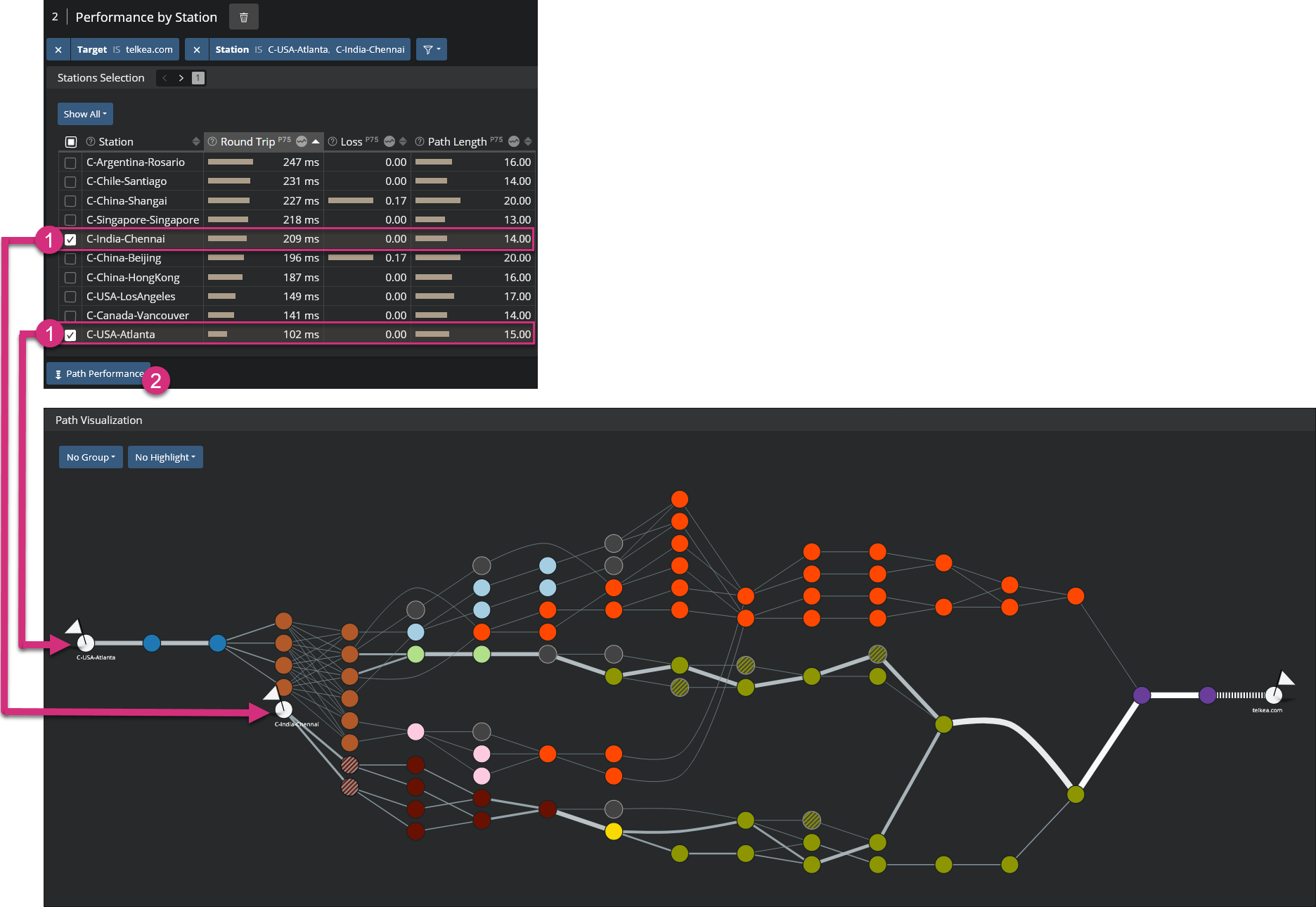
The Kadiska interface lets you compare network paths to a specific target from different Kadiska Stations. From the section "Performance by Station", select the Kadiska Stations and click on "Path Performance".
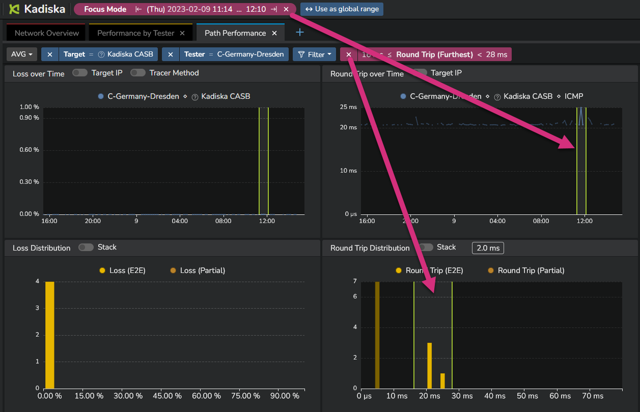
Focus mode and distribution graphs
In some cases, you could observe high and constant variations of one metric.
The following example shows that the network latency is constantly changing from 5ms to more than 20ms.
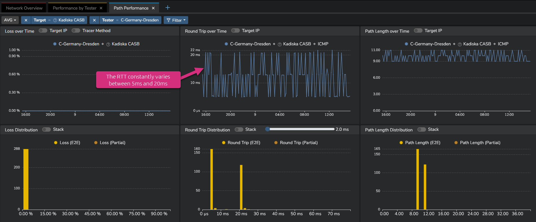
In order to focus on the higher RTT values, you can make use of the distribution graph.
Simply select the highest values in the distribution (drag&drop) and the corresponding network paths will be automatically highlighted.
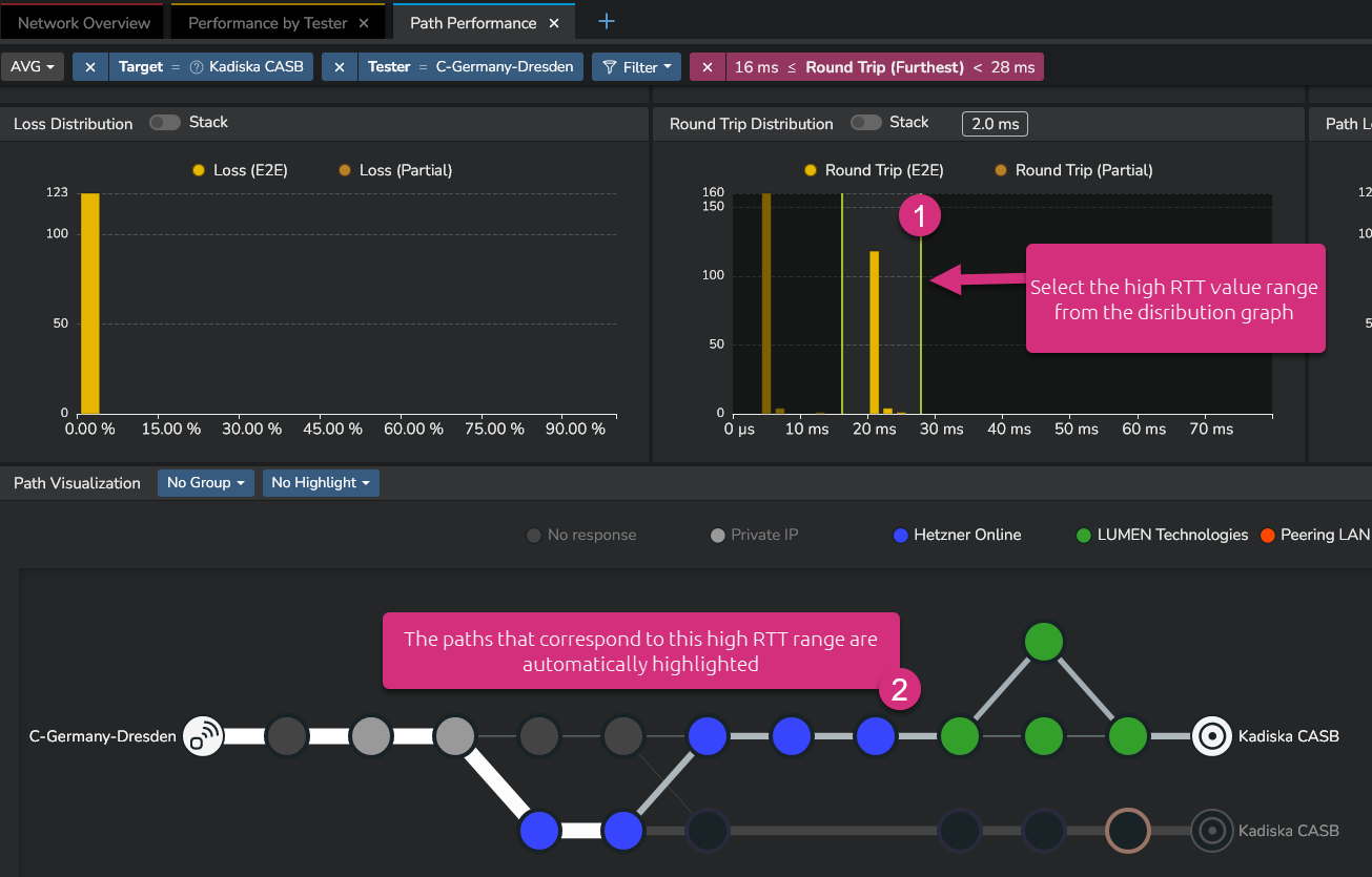
From the screenshot above, you see that the Net-Tracer tests alternativally target two distinct destinations.
These are identified during the initial DNS resolution process of the Net-Tracer.
The DNS resolution process only applies to URL-based targets. There is no DNS resolution required when the Net-Tracer target is identified by its IP address.
Notice that this filter based on the distribution graph can be combined with a focus mode configured in any timeseries. The network path visualization will take these parameters into account in order to highlight the corresponding network paths:
Distinguish between different target IP addresses
When the DNS resolution process discovers multiple destinations, it can be useful to visualize performance metrics for each of them independently.
This can be done by activating the "Target IP" option in the corresponding timeseries.
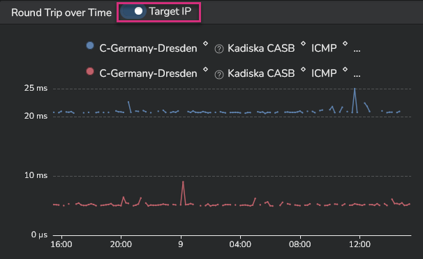
On the screenshot above, you can easily identify the target that relates to the highest network latency values.
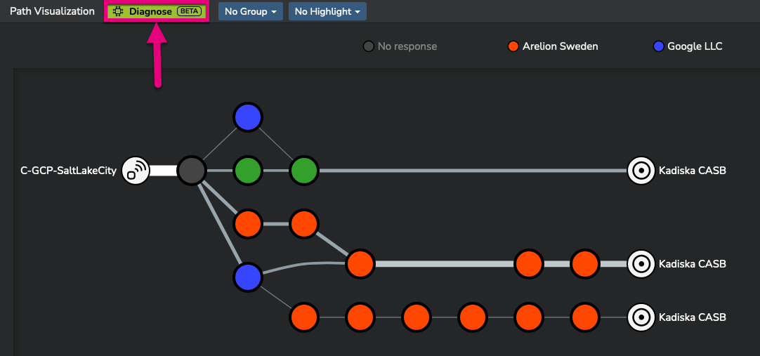
Automated diagnostic
Although you can manually analyze network performance to identify the root cause of degradation, Kadiska's machine learning engine can automatically diagnose various types of network problems. It is able to identify:
- degradations at some specific routing nodes or links levels
- suboptimal DNS resolution process
- suboptimal BGP routing between distinct operators
- suboptimal routing within a specific operator
To request an auto diagnostic, from the "Path visualization" widget, simply click on the "Request auto diagnostic" button:
The following example pertains to monitoring how US-based users connect to their local CASB provider.
During this monitoring, some temporary increases in network latency were observed:
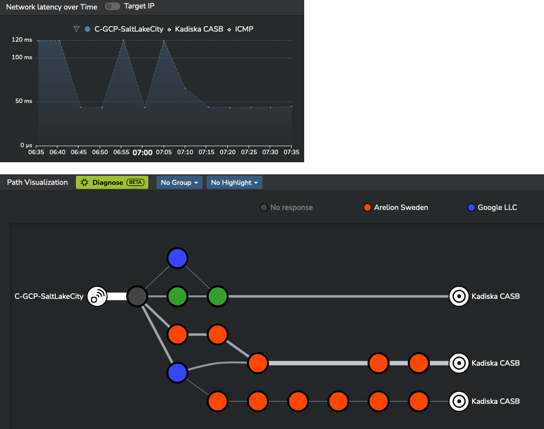
The Kadiska machine learning engine provides a complete explanation of the phenomenon:
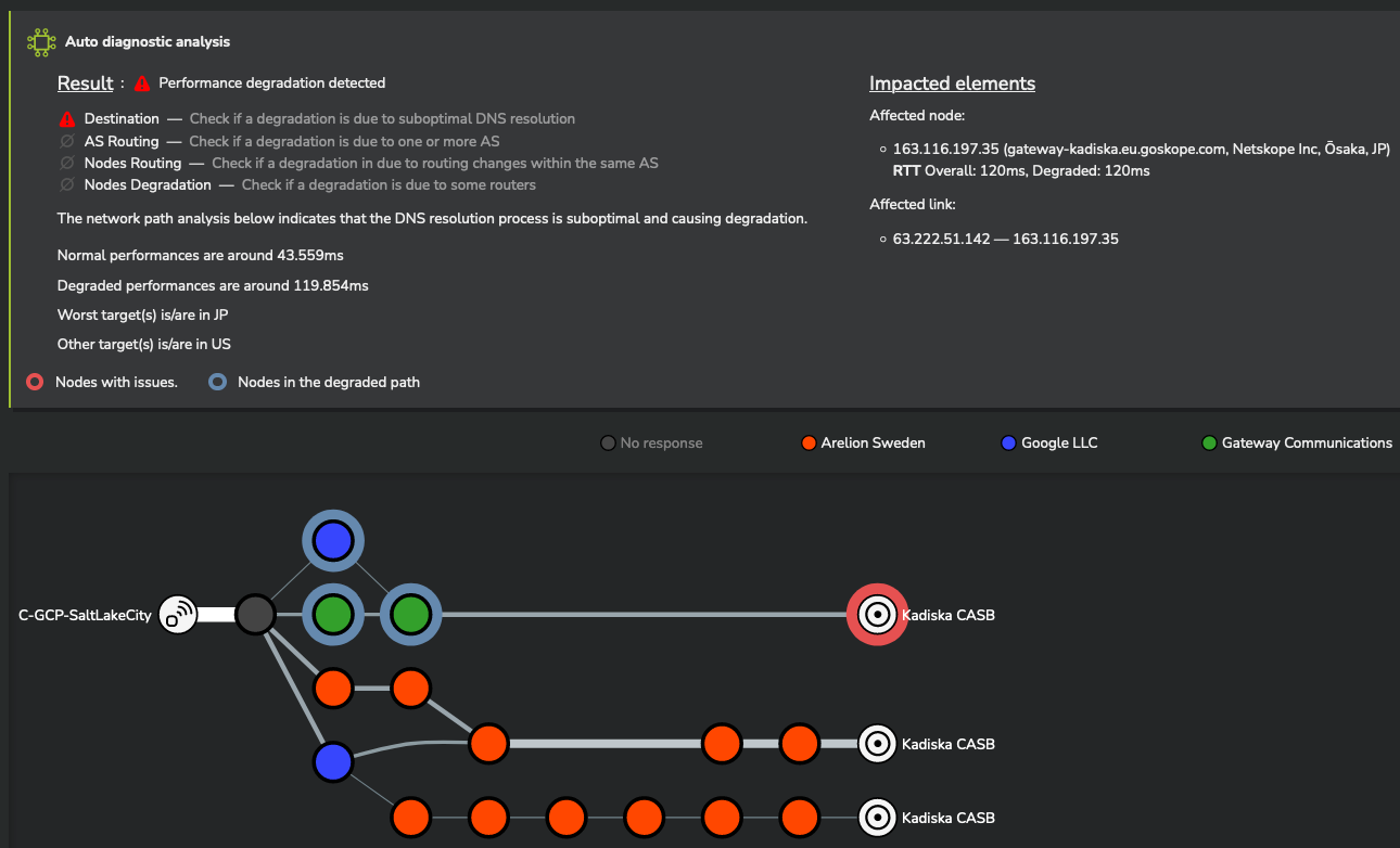
Kadiska was able to precisely measure the network latency degradation and identify its root cause.
In this case, US-based users were temporarily redirected to a distant CASB node located in Japan, instead of connecting to the closest CASB node in the United States.
The Kadiska machine learning engine is only active when you specify a combination of a single Tester and a single Tracer target.